Smart Interface Design Patterns - Part I
Empowering Users Healthcare Management
Context
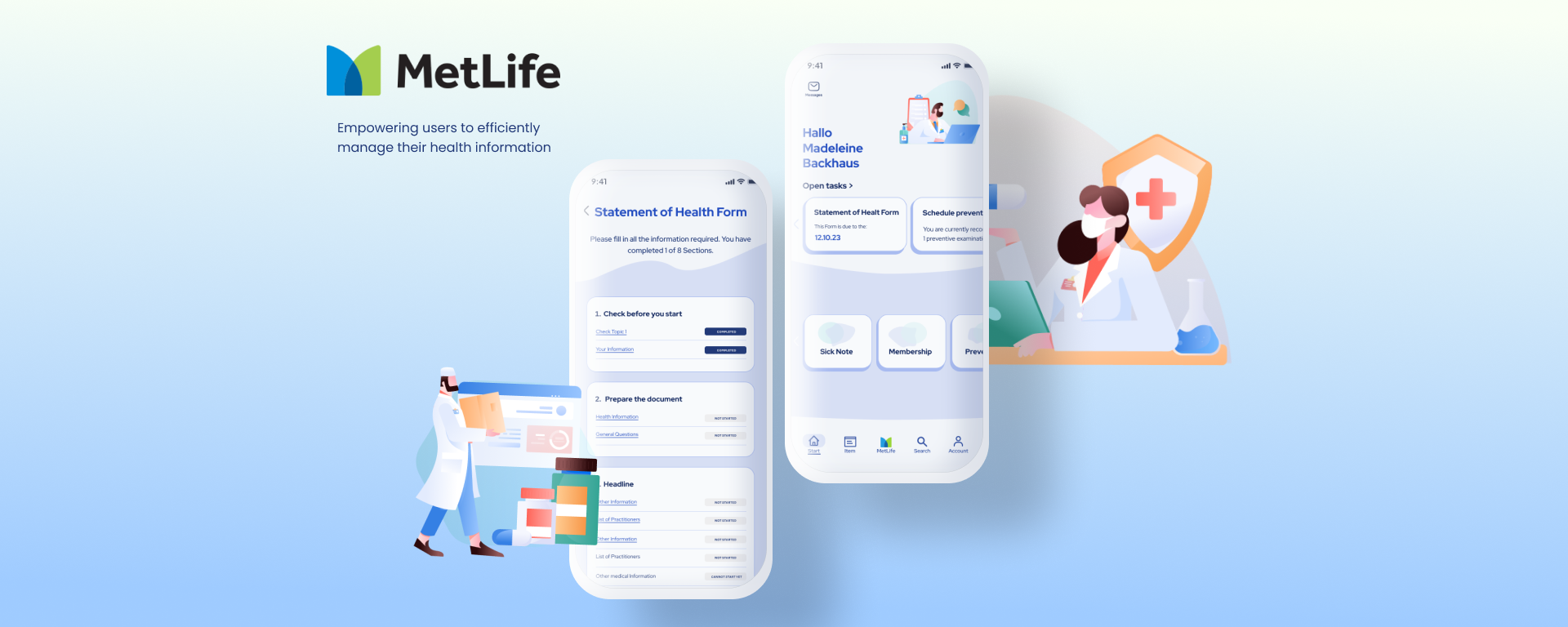
In the Smart Interface Design Patterns workshop, lead by Vitaly Friedman, I undertook the redesign of the MetLife healthcare app, aiming to empower users to efficiently manage their personal information and stay informed about relevant medical updates. The focus was on enhancing accessibility and usability, ensuring a smooth user experience while adhering to strict privacy regulations.
Project Goal:
The goal is to redesign the MetLife Statement of Health Form to leverage the benefits of digital interfaces, ensuring relevant questions are surfaced based on user context, providing clear error handling, and optimizing the layout for mobile devices to improve completion rates and data accuracy.
Project Constraints:
- Should have high completion rates,
- Should have high accuracy rates,
- Should have high error recovery rate,
- Should reduce the number of requests for service desk,
- Should provide first-class UX and first-class accessibility (WCAG 2.2)
Findings
The current practice of transforming print forms to digital by replicating them 1:1 is suboptimal, due to the inherent differences between print and digital mediums. Digital forms offer dynamic capabilities, such as real-time feedback and user guidance, which are not utilized in static print forms. This leads to inefficiencies and user frustration.
My UX concept
My UX concept aims to optimize digital form experiences with a strong focus on user-centric design. The goal is to achieve high completion and accuracy rates, supported by effective error recovery strategies. The forms should accomodate diverse user needs including neurodiversity and accessibility considerations. Privacy compliance (CCPA/GDPR) and streamlined processing times are key priorities, ensuring a first-class user experience across mobile devices while maintaining consistency across all forms.
Paper Wireframes & Tought Process
Task Oriented Interface:
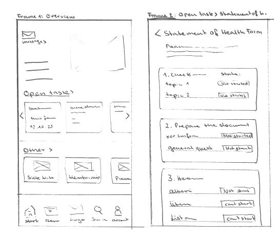
The app's initial screen prominently features an "Open Tasks" section, guiding users on tasks such as filling out health forms. This ensures that users are immediately directed to their pending tasks upon accessing the app, enhancing user engagement and task completion rates. Each card displaying open tasks also shows the user the due date and other important information. Messages are located at the top left of the screen, with a number next to the icon indicating the amount of new or unread messages. Below the open task cards, additional helpful items like sick note information and membership details are easily accessible. All of this is depicted in Frame One.
Organized Health Forms:
Health forms are organized into distinct sections, allowing users to complete each section independently. This modular approach streamlines the form completion process, making it more manageable and less overwhelming for users. The app clearly indicates the status of each section, showing what still needs to be filled out, what has been started, what is completed, and what cannot yet be started. This organized structure is shown in Frame Two.
Contextual Guidance:
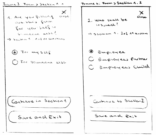
When entering a section from the overview, a hint text clearly states which section the user is in and how many questions remain. This contextual guidance helps users navigate the form with ease and understanding as seen in Frame 3.
Save Progress and Resume:
Users have the option to save their progress and exit at any step, ensuring flexibility and convenience. They can seamlessly resume their tasks from where they left off, eliminating the need to start over and enhancing user satisfaction. The health form overview will indicate which section has been started, allowing users to continue to the next section as needed.

Clear and Descriptive Form Fields
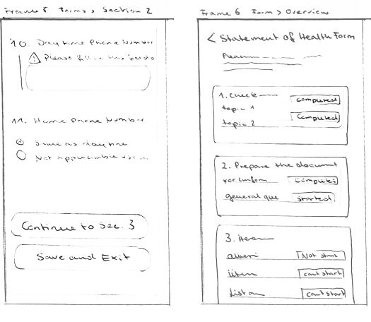
All form fields have a label and descriptive text to ensure the user understands what information needs to be filled in. For unique information, the hint may also indicate where to find the required details and describe the expected format. Long number inputs will have auto-formatting to make the information easier to read, as seen in Frame 5. In Frame 5, we can also see how to input a date. The expected format is described in the hint text below the label. Users can either fill in the date directly or click on the calendar button to access an accessible date picker. This ensures clarity and ease of use, enhancing the overall user experience.
Clear Error Handling and Progress Overview
As seen in Question 10, clear error handling is essential. A red line should appear next to the form field, clearly indicating where the mistake has occurred. The error message needs to be precise and descriptive. In Frame 6,
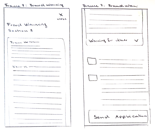
Contextual Fraud Warning and Submission Options
In Frame Seven, we can see the fraud warning, which contains a lot of information specific to each state. The form should recognize the state the user has provided in Section 2 about general information and display the correct section for the user's state. Additionally, warnings for other states can be accessed via an accordion. Since the fraud warning is usually the last step in the process, if all information is filled out, the user will see a button to send the application. If not all information is filled out, there should also be a save and exit button. The send application button could also be placed more prominently in the overview of the health form.
Results
- Improved Completion Rates: The redesigned form interface aimed to simplify the form-filling process, potentially leading to improved completion rates.
- Enhanced Data Accuracy: Efforts were made to implement clearer error handling and validation mechanisms, aimed at reducing submission errors and improving data accuracy.
- Accessibility Improvements: Adhering to WCAG 2.2 AA accessibility standards aimed to improve accessibility for users with disabilities, ensuring a more inclusive form experience.
- Consistent User Experience: Maintaining consistency across forms and devices aimed to provide a seamless user experience, focusing on usability and user satisfaction.
- Enhanced Clarity with Labels and Descriptions: The inclusion of clear labels and descriptive text aimed to guide users effectively through each form field, improving understanding and reducing errors.
- Error Handling: Implementation of robust error handling mechanisms aimed to provide clear feedback to users, helping them identify and resolve issues promptly, thereby enhancing overall user experience and form completion efficiency.
Let's get in touch!
Do you want me to give a talk or a workshop for your company or conference? Are you looking for some help with UX research, design and strategy? Let’s get in touch!
[email protected]