Scrum Master

Simplifying Agile estimations
My Role
UI/UX Designer — Feature Scoping, Research, Interaction Design, Visual Design, Prototyping
Team
Timeline & Status
1 year, launched
Overview
Following the feedback of our colleagues, we realized that there is a need for a new application, that helps agile teams with the story estimation process. Most existing solutions were either feature incomplete, only available on specific platforms, or did not meet the design expectations.
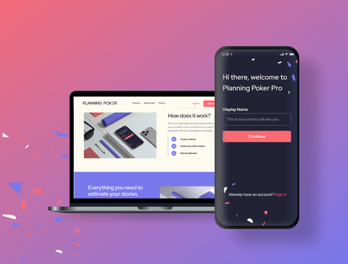
I led the end-to-end design direction of the web and app experience for Planning Poker and played a pivotal role in the marketing aspects.
The website's launch was met with outstanding public sentiment from the community.
In 2023 the Prime Force GmbH noticed an increased friction with in-use story estimation applications. The major friction was with teams of larger projects, where multiple dev teams and stakeholders were involved in the estimation process.
No app on the market fulfilled all the different needs of agile practitioners. This was further facilitated by the need for cross-functional teams, because the company had a focus on good collaboration between the design and software development team.
For the MVP we wanted to focus on the mobile app. During the process, it became apparent that the desktop version would be needed sooner than expected, therefor the scope was expanded to include it as well.
Increase the team satisfaction for the story estimation process.
To understand the needs and pain points of potential users, we invited 8 agile practitioners from software engineers, designers and stakeholders. The focus was on understanding how teams currently estimate tasks, challenges faced during the process, and features they would like in a digital story estimation tool.
We asked users if they already use a digital story estimation tool, what features they use, what they like and dislike, and so on.
Key Insights:
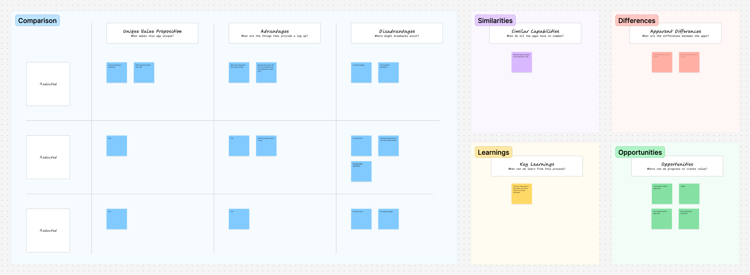
We analyzed existing Scrum Poker tools to identify strengths and weaknesses. Our research highlighted gaps such as outdated interfaces, lack of customization, and limited integration with popular project management tools.
Key Findings:
Based on the research findings, we developed detailed personas to guide our design process.

Scrum Master

Developer

Product Owner

Stakeholder
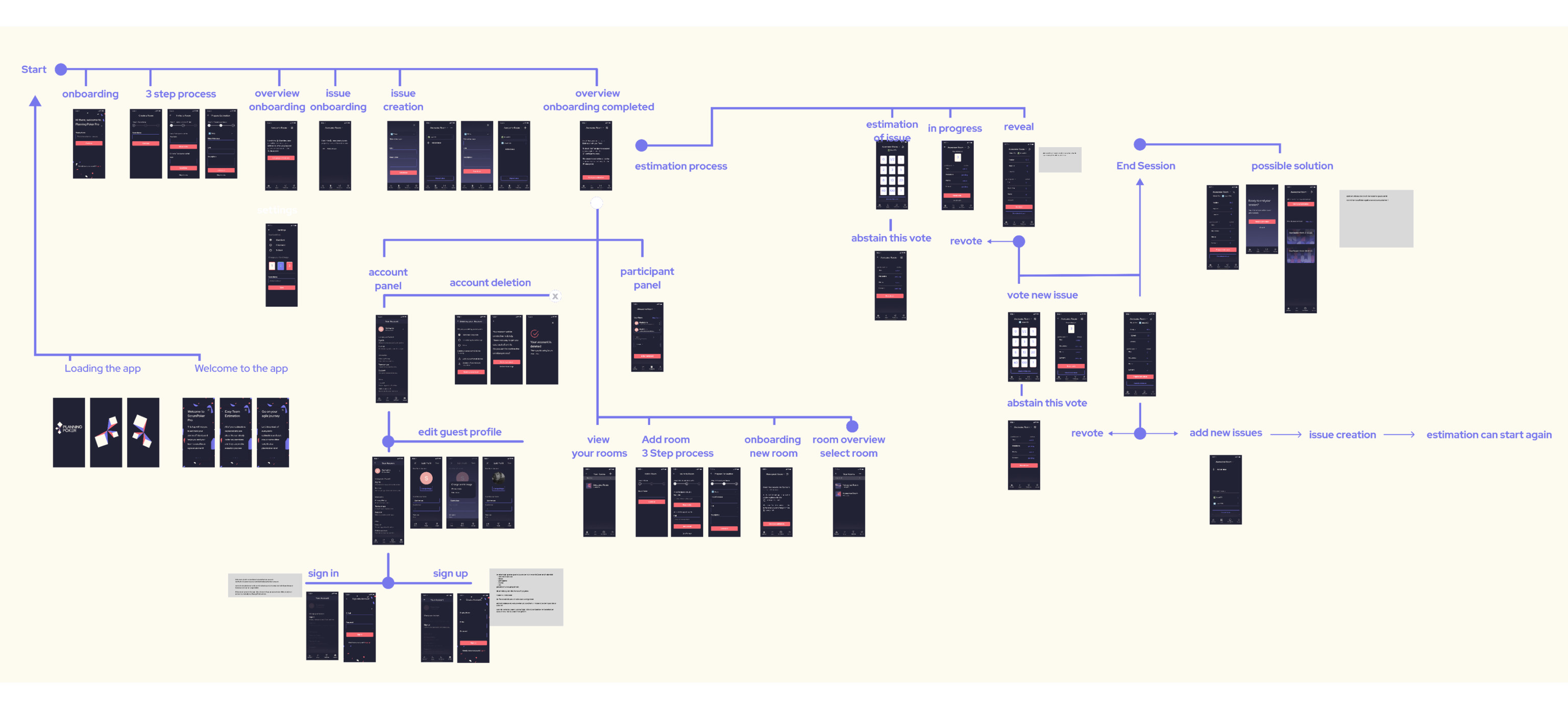
We mapped out user journeys for different personas and scenarios to understand their interactions with the application.
1. John Murphy (Scrum Master)
2. Maria García (Developer)
3. Emilie Moreau (Stakeholder)
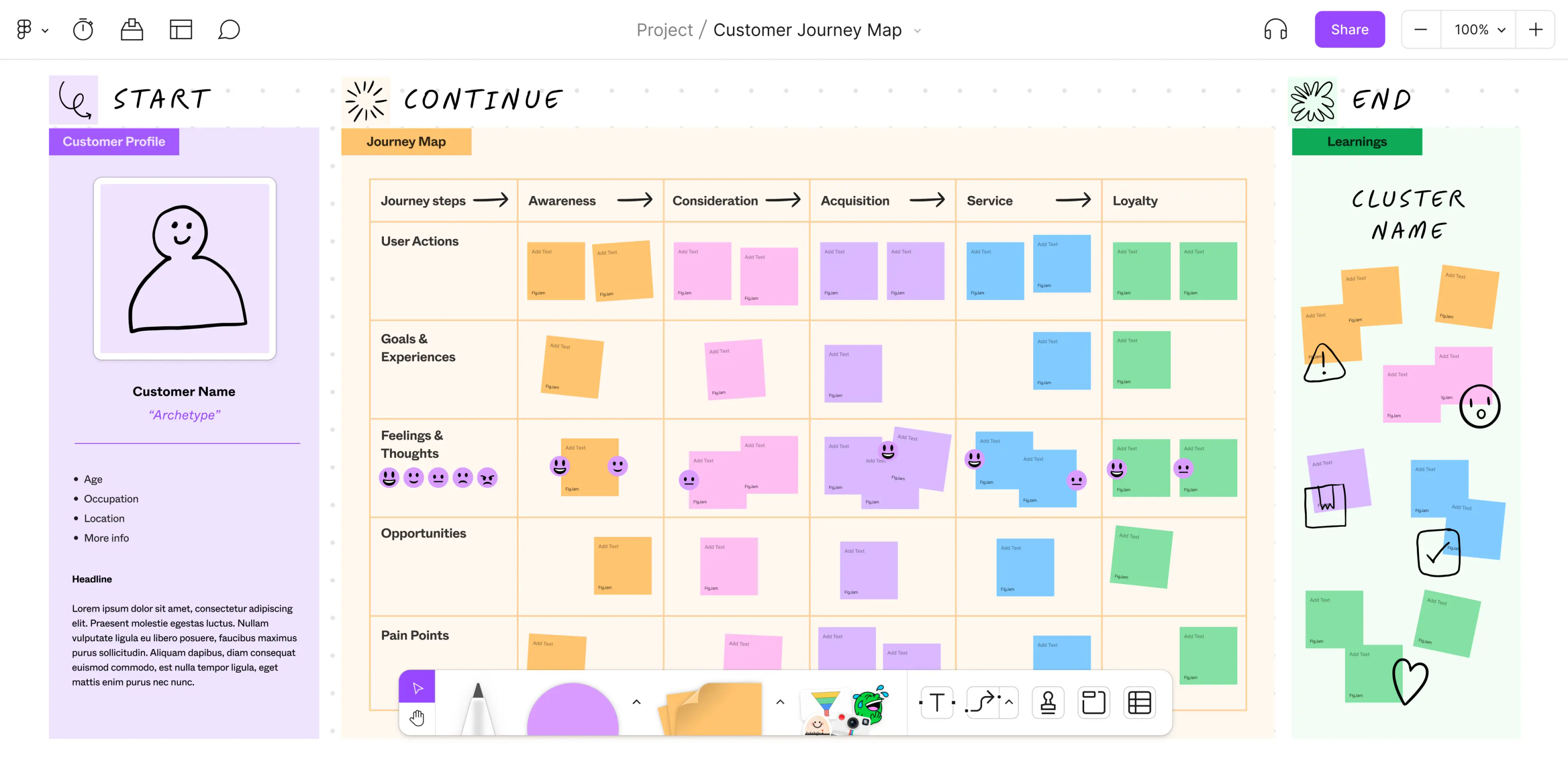

Journey Mapping for Different User Roles
The journey maps helped identify key touchpoints and potential friction areas. For example, onboarding new users needed to be straightforward to prevent drop-offs.
To rapidly create a prototype, we focused on the app version of the Planning Poker application. We identified the persona of the Product Owner as the most challenging, but also most vital flow, which is why it became our first priority.
For the project no existing design system nor component library was available. To go with the visual direction we had in mind we would later have to decide on those as well. But to get things moving we wanted to first focus on low-fidelity prototypes, without the design overhead. We cleared the schedule for me as a designer, the product owner, and the mobile app developer (Flutter), and got to work.
During the sprint, we defined the information architecture and navigation and created a Figma prototype for usability tests.
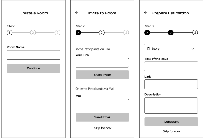
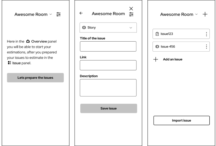
Initial wireframes focused on the core functionality:
For project owners, the app offers a streamlined process to create rooms, invite participants, and prepare issues in advance. This journey starts with creating a room and inviting participants via email or an invite link in an easy three step process. Project owners can then categorize issues as stories or tasks, link directly to Jira tickets, and add detailed descriptions.
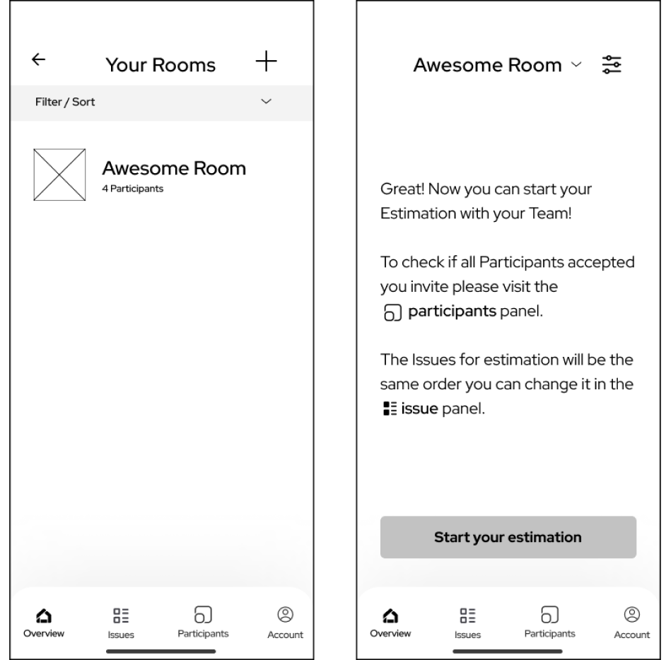
The overview panel provides a summary of all created rooms, displaying the number of participants and offering the option to add new rooms. This feature ensures project owners can manage multiple projects efficiently.
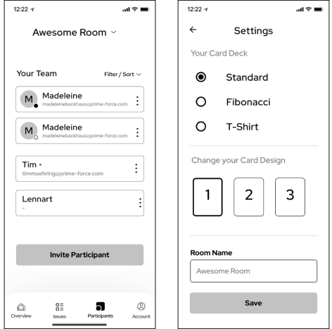
Customization options are available in the settings panel, where users can choose the card design, card deck, and change the room name. This allows for a personalized experience, enhancing user satisfaction.
Managing participants is straightforward with the participant panel, which shows who has been invited, who has accepted the invite, and allows for adding or deleting participants as needed.
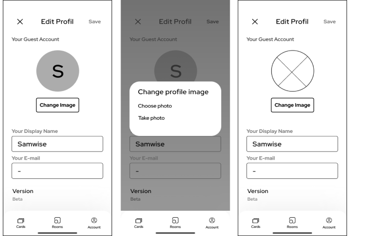
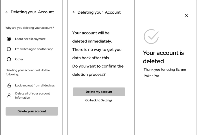
The account deletion has no complicated steps an can be easily found in the account settings. After clicking "delete account" there is a double confirmation to ensure you don't accidentally delete the account. After a successful deletion, you get a visual confirmation on the screen
The core feature of the app is the estimation process. When an issue is being estimated, the card deck is displayed above the issue details. Participants can select their cards until the room owner reveals the estimation. The room owner can see who has voted and which votes are still pending. Once revealed, the median, highest, and lowest estimations are shown. Previous estimations are stored under the issue panel for future reference.
Estimation Screen: A screen showing the card deck and issue details. Voting Screen: A screen showing participant votes and results.
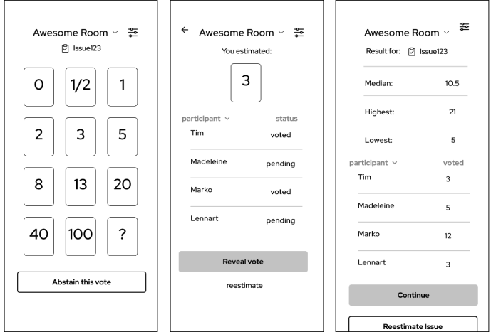
The product owner has the estimation under their control, they can evaluate if it makes sense if the participate at the vote or abstain the vote. this descision can be taken for every single issue estimated.
Usability Testing Sessions: I conducted several rounds of usability testing with real users to identify any issues or areas for improvement. Most of the sessions were held remotely, which was an interesting challenge.
Feedback Collection and Analysis: Feedback was collected via surveys and post-session interviews. Key improvements were made based on this feedback.
Iterative Improvements: Based on users feedback, we made several iterations to enhance the user experience, such as simplifying the onboarding process and improving the clarity of instructions.
Additionally, it became really apparent that both the app and web version would be needed.
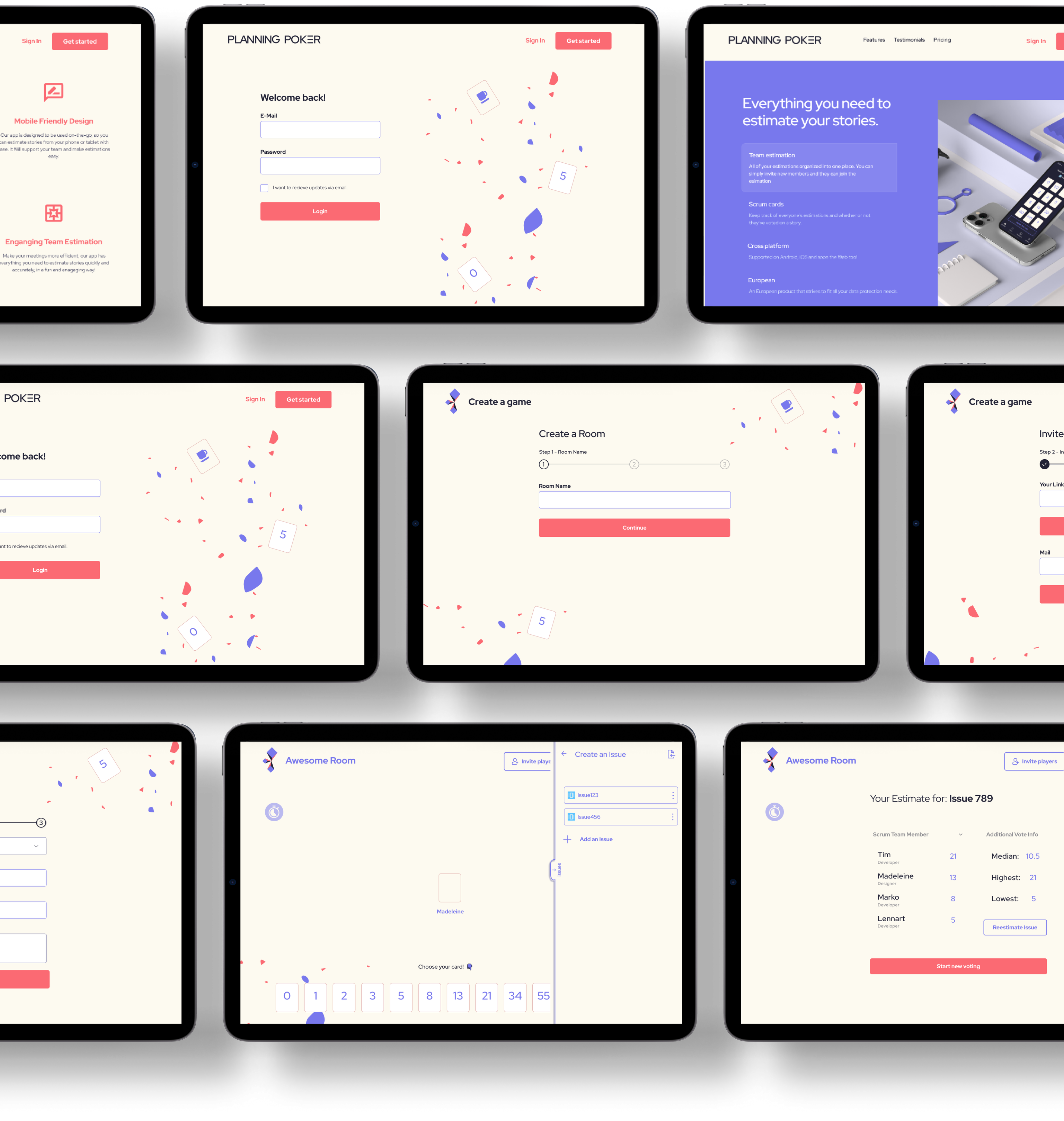
We approached the development of the desktop version by first creating a landing page that clearly outlined the app's benefits, features, user testimonials, and pricing plans. This page also offered users a straightforward way to either sign in or get started with the platform. While maintaining the overall consistency with the mobile experience, the desktop version was designed with a light mode to create a subtle visual distinction between the two platforms.
To ensure a seamless and intuitive experience, we applied the same design patterns and logic across both the app and web versions. This consistency was crucial in preventing user confusion and building familiarity across platforms. For example, the three-step onboarding process that effectively guides and educates users on mobile was mirrored in the web application, ensuring every step is clearly explained regardless of the device being used.
The web version, however, leverages its larger screen real estate to enhance certain aspects of the interface. For instance, the issue creation process on the web is handled via a side panel, allowing users to interact with other elements of the interface without interruption. Additionally, the general overview during estimation sessions has a more spacious layout on desktop, offering a broader and more detailed view, which wouldn't be as feasible on mobile due to the smaller screen size.
By optimizing the design for each platform while maintaining consistent user flows, we were able to create a cohesive experience that feels familiar yet tailored to the strengths of both mobile and desktop.
The Design Principles of Planning Poker were:
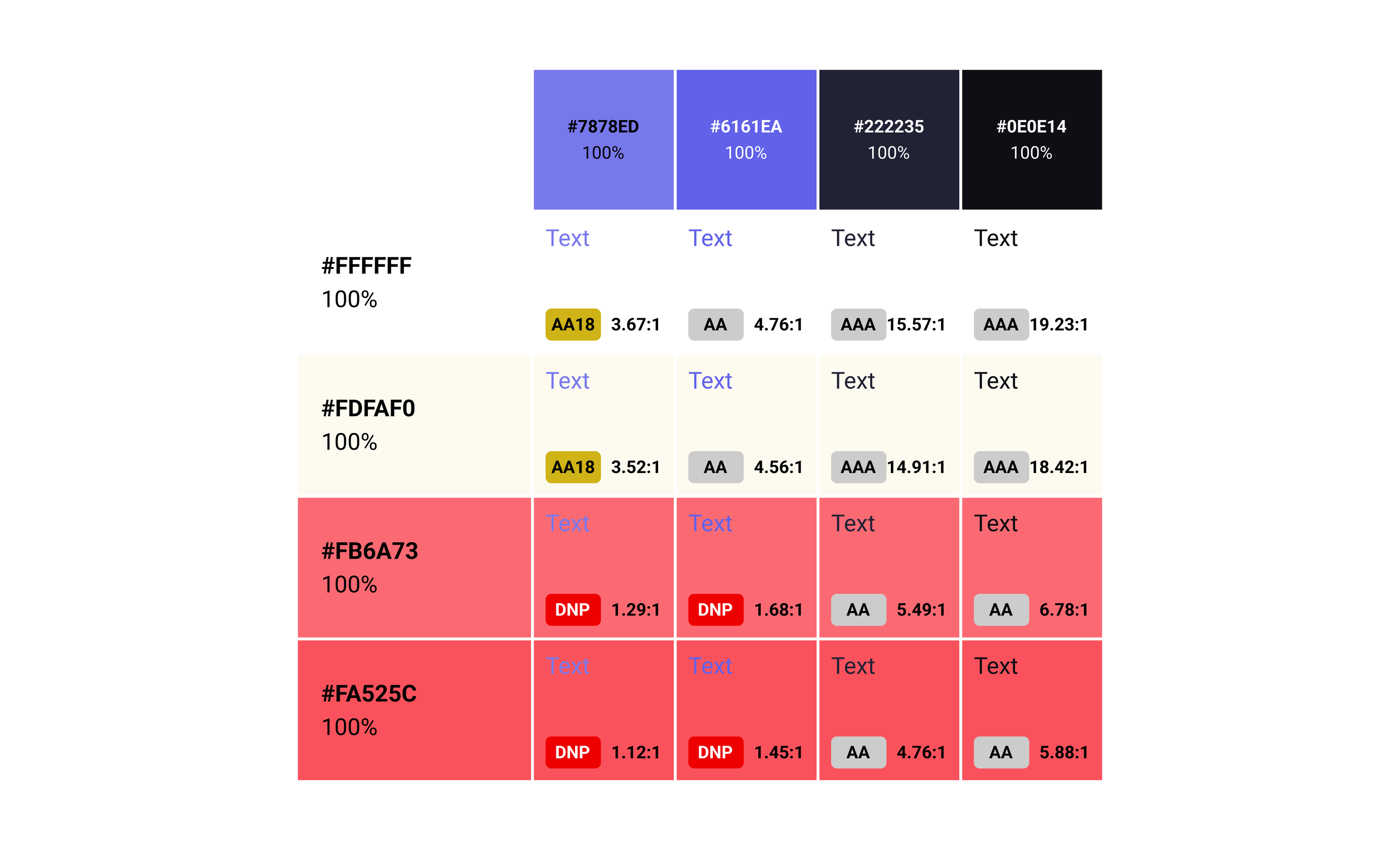
We chose a color palette that was both modern and accessible, ensuring good contrast and readability.
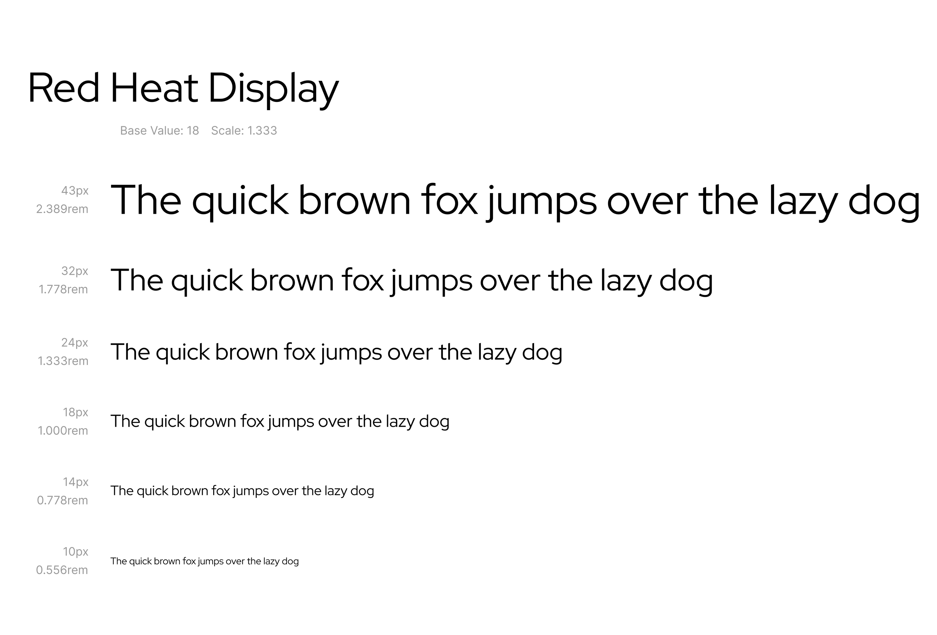
As the main Font, I selected Red Hat Display for its clean, modern aesthetic. This font offers a geometric style that feels contemporary and refined, yet remains highly readable, which is essential for user engagement across various screen sizes and device types.
The type scale I implemented, as seen in the image, follows a base value of 18px with a scale of 1.333, creating a harmonious visual rhythm across different font sizes. This scale ensures that typography maintains consistency in its hierarchy and readability, which is crucial for both body text and headlines.
Ultimately, Red Hat Display strikes the right balance between professionalism and a touch of fun, making it the ideal choice for an app that values clarity, inclusiveness, and a modern design sensibility.
I created a dynamic splash screen animation for the app's loading phase. It started as a vector-based animation, that I fine-tuned based on the developers needs and the React Native/Expo specifications. This animation not only serves to entertain users while the app loads, but also reinforces brand identity by using smooth transitions and the app's color palette.
Beta Launch Strategy: A beta version of the app was launched to a select group of users to gather early feedback and make final adjustments.
User Onboarding Process: We developed a comprehensive onboarding process, including tutorials and tooltips to help users quickly learn how to use the app.
Working on the Planning Poker App has been a rewarding journey that has allowed me to grow significantly as a UX designer. From its initial stages as an internal project to its expansion into a robust cross-platform tool, I've learned invaluable lessons in user-centered design, collaboration, and iterative development.
Throughout the project, I've had the opportunity to lead the UX design efforts, focusing on creating a user-friendly interface that meets the specific needs of Scrum teams. This experience has not only strengthened my technical skills but also deepened my understanding of how to integrate design seamlessly into agile processes.
The addition of the desktop version was particularly fulfilling as it broadened the app's accessibility and functionality, showcasing our team's adaptability and commitment to enhancing user experiences across different platforms.

Do you want me to give a talk or a workshop for your company or conference? Are you looking for some help with UX research, design and strategy? Let’s get in touch!
[email protected]